
Have you ever walked into a high-end hotel room or a luxury home and instantly felt a wave of calm, excitement, or sophistication? That isn’t an accident. It is the result of luxury interiors design psychology—the art and science of how colors influence our emotions, behaviors, and perception of space.
Choosing the right paint colors or wall finishes for your home is more than just picking a pretty shade. Whether you are refreshing a cozy primary suite, a productive home office, or a formal salon, understanding color psychology helps you craft spaces that feel both stunning and deeply personal. Let’s explore how expert designers use color and finish to transform everyday rooms into luxury sanctuaries.
1. Creating Intimacy with Deep, Moody Jewel Tones
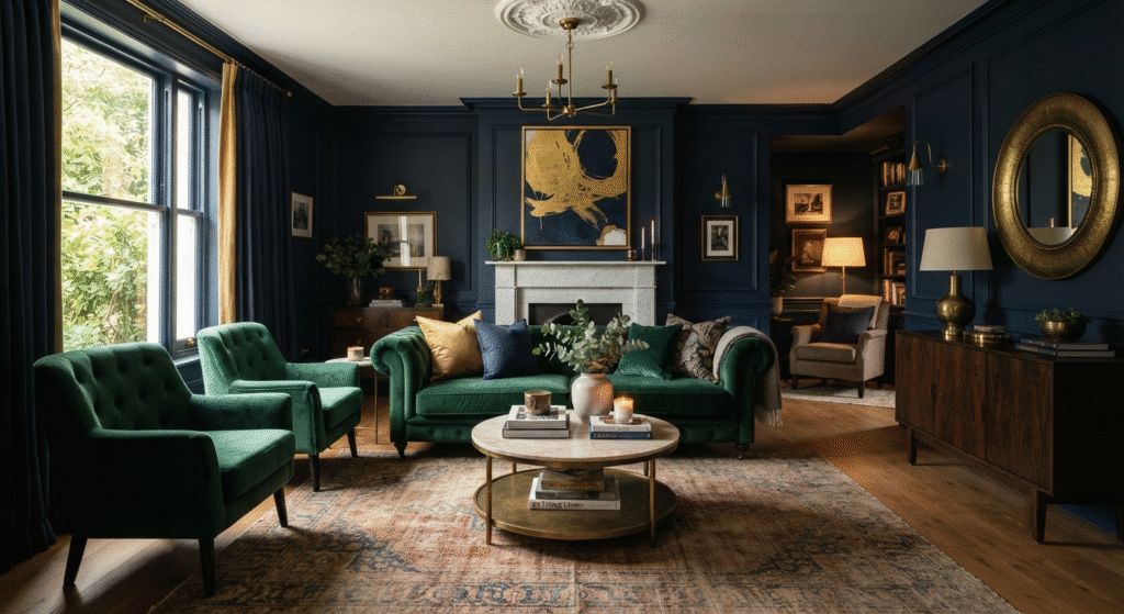
When you want a room to feel cozy, grounded, and wrapped in luxury, bright white walls won’t do the trick. Instead, high-end interior designers turn to deep, moody jewel tones like midnight navy and forest emerald.
- The Vibe: Rich, enveloping, and dramatic.
- Where to use it: Primary bedrooms, moody home offices, or private reading dens.
- Why it works: Dark, saturated colors absorb light rather than reflecting it fiercely. This creates an intimate, cocoon-like atmosphere that lowers stress and encourages relaxation. A midnight navy bedroom instantly whispers “bedtime,” while a forest emerald office inspires focused, quiet contemplation.
2. Maximizing Light with Warm Neutrals and Layered Whites
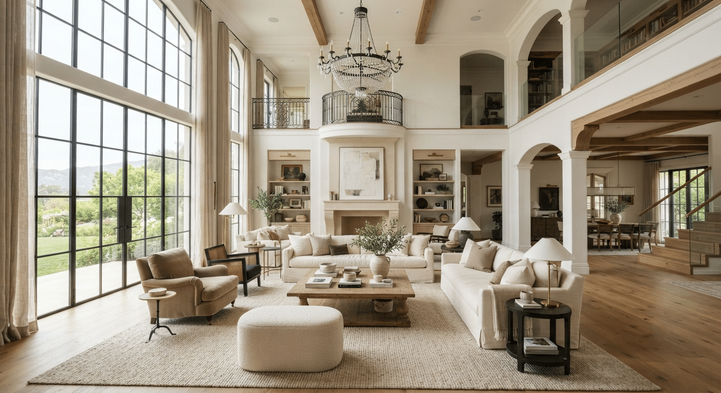
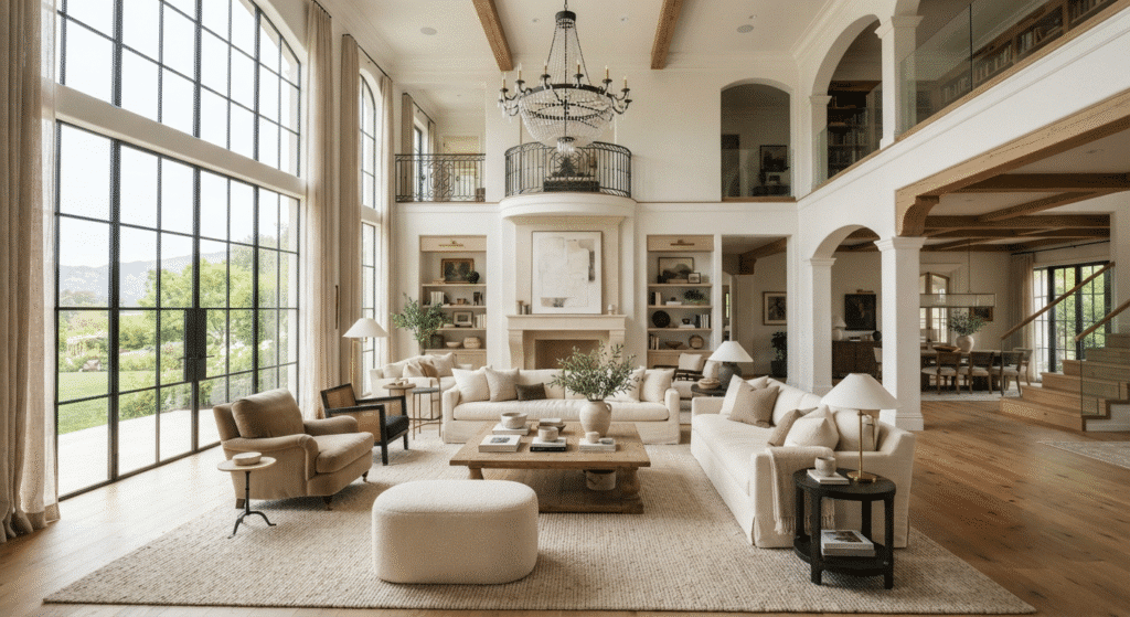
On the flip side, what happens when you are dealing with expansive, high-ceilinged spaces that risk feeling cold or empty? The secret to luxury here is mastering warm neutrals and layered whites.
- The Vibe: Airy, open, welcoming, and bright.
- Where to use it: Grand living rooms, open-concept kitchens, and sun-drenched entryways.
- Why it works: Pure stark white can sometimes look sterile or clinical under bright sunlight. Luxury Interiors/spaces solve this by layering different shades of warm cream, ivory, linen, and beige. These subtle variations bounce natural light around the room, making massive spaces feel inviting, harmonious, and full of gentle life rather than cavernous and cold.
3. Adding Architectural Depth Through Finish Sheens
Color is only half the equation; the finish sheen of your paint plays an equally vital role in luxury interior design. By contrasting finishes, you can trick the eye and add incredible architectural depth to standard walls.
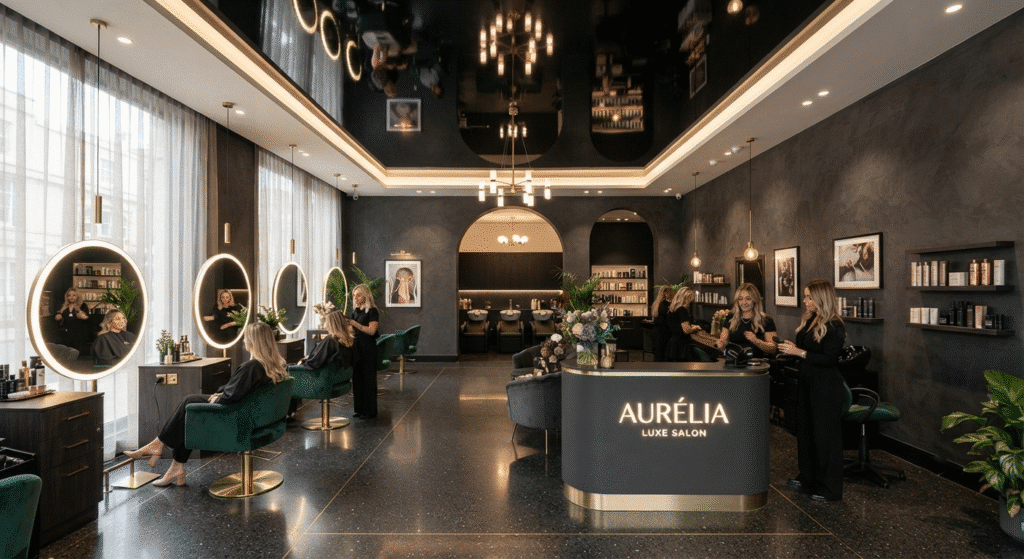
- The Technique: Pair ultra-matte walls with a high-gloss ceiling.
- Where to use it: Formal salons, dining rooms, or powder rooms.
- Why it works: Ultra-matte paint absorbs imperfections and gives walls a velvety, soft-touch texture that feels expensive. Meanwhile, a high-gloss or lacquered ceiling acts like a subtle mirror, reflecting light downward and visually pushing the ceiling height upward. This clever interplay of textures adds a layer of bespoke craftsmanship that elevates the entire room.
Bring Luxury Home
Transforming your home with color doesn’t require a complete structural overhaul. By selecting moody jewel tones for intimacy, warm neutrals for light-filled spaces, and thoughtful sheens for texture, you can completely redefine the mood of any room. Take a cue from high-end design: let your walls speak, and watch your living spaces come alive.
Frequently Asked Questions (FAQs)
- What are the best paint colors for a cozy primary suite?
Deep, moody jewel tones like midnight navy and forest emerald work wonderfully in primary suites because they absorb light, creating an intimate, grounding, and relaxing atmosphere.
- How can I make a high-ceilinged room feel less empty and cold?
You can maximize natural light and warmth by using layered warm neutrals, creamy whites, ivory, and beige. This bounces light gently around expansive spaces, making them look open yet inviting.
- What is the benefit of pairing ultra-matte walls with a high-gloss ceiling?
This design technique adds incredible architectural depth. Ultra-matte walls give a soft, velvety texture that hides imperfections, while a high-gloss ceiling acts as a subtle mirror to reflect light and visually elevate the ceiling height.
- Are dark jewel tones suitable for a home office?
Yes! Colors like forest emerald and midnight navy help foster quiet contemplation and a focused, distraction-free environment, making them ideal for productive home offices.